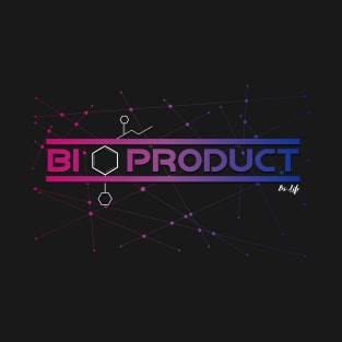
This design was inspired by a joke from my wife when she said "𝗢𝘂𝗿 𝟰 𝗸𝗶𝗱𝘀 𝗮𝗿𝗲 𝗮 𝗕𝘆𝗽𝗿𝗼𝗱𝘂𝗰𝘁 𝗼𝗳 𝘂𝘀" I laughed at her pretty hard. She had recently come out to me as being Bisexual I responded to her, "𝗻𝗼 𝘁𝗵𝗲𝘆 𝗮𝗿𝗲 𝗮 𝗕𝗶-𝗣𝗿𝗼𝗱𝘂𝗰𝘁!" We laughed so hard because we are both Dorks! 🤓
Tags:
bisexual, bisexuality, bisexual flag, lgbtq pride gifts, bisexual pride gifts
This design was inspired by a joke from my wife when she said "𝗢𝘂𝗿 𝟰 𝗸𝗶𝗱𝘀 𝗮𝗿𝗲 𝗮 𝗕𝘆𝗽𝗿𝗼𝗱𝘂𝗰𝘁 𝗼𝗳 𝘂𝘀" I laughed at her pretty hard. She had recently come out to me as being Bisexual I responded to her, "𝗻𝗼 𝘁𝗵𝗲𝘆 𝗮𝗿𝗲 𝗮 𝗕𝗶-𝗣𝗿𝗼𝗱𝘂𝗰𝘁!" We laughed so hard because we are both Dorks! 🤓
Tags:
lgbtq, bisexuality, rainbow, bi pride, equality
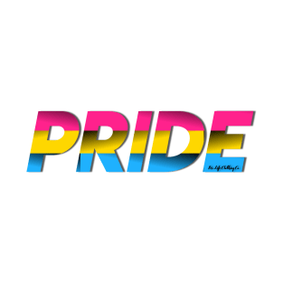
Created on the web in 2010, this flag has colors that represent pansexuality's interest in all genders as partners. The pink represents women, yellow nonbinary and gender-nonconforming people, and the blue is for men.
In 1977, Harvey Milk challenged Gilbert Baker, a veteran who taught himself to sew, to come up with a symbol of pride for the gay community. His response? The original Pride flag. Inspired by Judy Garland's "Over the Rainbow," these colors flew at the San Francisco Gay Freedom Day Parade celebration on June 25, 1978. Though some dispute whether Baker was the sole creator of the flag that started it all, its symbolism remains. Each color celebrates an aspect of queer Pride:
Hot pink = Sex
Red = Life
Orange = Healing
Yellow = Sunlight
Green = Nature
Turquoise = Magic/Art
Indigo = Serenity
Violet = Spirit
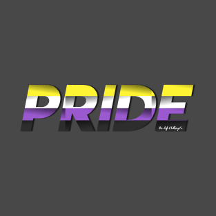
Created by 17-year-old Kye Rowan in 2014, this flag was a response to nonbinary people feeling improperly represented by the genderqueer flag. This symbol was not to replace Roxie's creation but sit beside it as an option. The yellow symbolizes gender outside a binary. The white, a mix of all colors, represents those with many or all genders. Purple stands in for those who feel both binary male and female or fluid between them. The black is for the agender community, without sexuality or color.
Featuring the symbol for the infinite number pi, which shares the first letter of "polyamory," this flag celebrates the infinite selection of partners available to polyamorous people. The letter is gold to represent the emotional attachment we have with others as friends and romantic partners, rather than just our carnal relationships.
Tags:
equality, poly, love, queer, polyamorous pride
Designed by Michael Page, the flag brings visibility to the bisexual community, showing the overlap of the stereotypical colors for boys and girls. The flag was inspired by an older symbol of bisexuality: the "biangles," two overlapping pink and dark blue triangles.
Tags:
queer, pride2017, gay pride, lgbt foundation, transgender
Designed in 2013 by the Organization Intersex International Australia, this flag intentionally features nongendered colors that celebrate living outside the binary.
If you want the most feminine pride flag, here it is. Although it's not a widely used symbol, it celebrates the femmes in the lesbian community, lovingly called "lipstick lesbians."
Though The New York Times named 2018 "the age of the twink," only the bears — as gay men lovingly refer to the beefier, more hirsute guys — have their own flag. Craig Byrnes designed it in 1995 for the International Bear Brotherhood. Its colors are to match the fur of bears living in the woods.
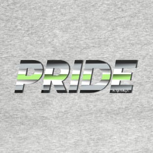
While asexual flags use purple to show their lack of sexual attraction, aromantic flags use green to celebrate the people who live without romantic attraction.
Tags:
lesbian, queer, asexual, aromantic flag, lgbtq pride
Whether the kink community should be added in the acronym LGBT is a heated debate, but there is no denying that the community has several of its own flags. This one was designed by Tony DeBlase for Chicago’s International Mr. Leather celebration in 1989. This symbol is not exclusively gay, but rather for the leather and BDSM community. The original flag is on display at the Leather Archives and Museum in Chicago.
While genderqueer people bend the rules of gender, agender people reject a gender completely. For their flag, the black and white stripes represent the absence of gender, while green, the inverse of the gender-heavy purple, represents nonbinary genders.
Monica Helms, a trans woman, designed this flag in 1999, and it was first flown at a Pride Parade in Phoenix a year later. “The light blue is the traditional color for baby boys, pink is for girls, and the white in the middle is for those who are transitioning, those who feel they have a neutral gender or no gender, and those who are intersexed,” Helms noted. “The pattern is such that no matter which way you fly it, it will always be correct. This symbolizes us trying to find correctness in our own lives.”
Tags:
trans, lgbt, equal rights, social justice, gay pride
Like the pansexual flag, the asexual flag was created in 2010. Inspired by the Asexual Visibility and Education Network logo, it represents many ace identities, including graysexuals (the fluid area between sexuals and asexuals) and demisexuals (people who don't experience sexual attraction unless they have an emotional connection with their partners.)
Tags:
lgbt, queer, asexual pride, the albert kennedy trust, asexual
Created in 2011 by Marilyn Roxie, the genderqueer flag highlights androgyny with lavender, agender identities with white, and nonbinary people with green. Some people refer to it as a nonbinary flag if they feel queer is a slur.
Tags:
lesbian, equal rights, gay, lgbt, social justice
The flag equivalent of "I support LGBT people, but no homo," this makes everyone feel included at Pride marches, even if they're celebrating other people's sexualities.
Tags:
lgbtq pride, lgbt pride, lesbian, gay rights, queer pride
This symbol is for members of the rubber and latex fetish community and is similar to its predecessor, the leather Pride flag. Peter Tolos and Scott Moats created the design in 1995 "as a means to identifying like-minded men and [it] reflects the sensory, sensual, and mental passion we have for rubber." They say the black color represents "our lust for the look and feel for shiny black rubber," the red symbolizes "our blood passion for rubber and rubbermen," while yellow highlights "our drive for intense rubber play and fantasies." It also features a literal kink, for obvious reasons.
Polysexuality, unlike pansexuality, is the attraction to multiple genders but not all. A middle ground between bisexuality and pansexuality, it is centered more around attractions to femininity and masculinity rather than gender itself. The pink represents attraction to females; the blue for males. The green is for an attraction to those who don't conform to either gender.